Portfolio Performance Chart

How to use a bubble chart to optimise your portfolio performance

… and see how to squeeze four dimensions into a two-dimensional chart.

From time to time you have to check your portfolio to find the underperforming assets and rebalance the allocation. Risk diversification and performance optimisation are the main aspects when rebalancing.

The conventional way

It’s time for rebalancing: How do your main assets perform? Which should be sold? Which position should be enlarged? Well, you might first create a conventional performance line chart. All lines aligned one year ago. There you see, which positions performed best over the last year.

conventional comparison by line chart
Conventional comparison by line chart

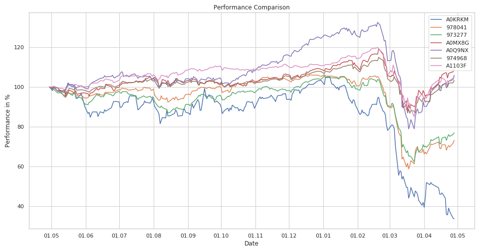
But how did your assets perform over the last three years? And did they still perform in the last three months? But most important: how did your large positions do? What are your largest positions anyway? Where is your money allocated? 
Even if you switch the timelines you still won’t see what your largest positions are.

The new visualisation

If you want to rebalance your assets you have to take all these criteria into account. Therefore I was looking for a visualisation that shows me all of the following in one view:

  • 3 year performance
  • 1 year performance
  • 3 month performance
  • position size

With a bubble chart I have found what I was looking for and so I did the following mapping:

  • x-axis: 3 year performance
  • y-axes: 1 year performance
  • bubble colour: 3 month performance
  • bubble size: position size.

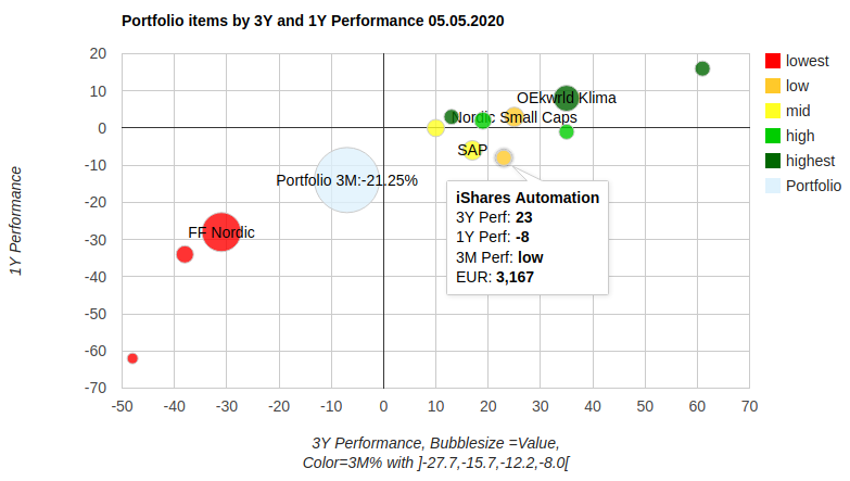
And this is the result:

comparison by new performance bubble chart
Comparison by new performance bubble chart

How to create the chart

The main components for creating this chart are: a comdirect ‘Musterdepot’ as data source, Google Charts bubble chart as visualisation and a python script as glue in between.

First I collected the portfolio positions in a comdirect Musterdepot (you have to register as member for free). Thereby it’s important to fill the values for ‘Stück’ to see the correct position size. After filling in the data you choose ‘Meine Übersicht’, click the ‘Konfigurieren’-button and add these columns:

  • Wert in EUR
  • WKN | Typ
  • Perf. 3 Monate
  • Perf. 1 Jahr
  • Perf. 3 Jahre

After adding these columns you export the portfolio to a csv-file.

This file and an HTML-Template (see repo: portfolioPerformance_in.html) are the input for the python script. The script calculates the data array for the google visualisation, performance info and the tick labels. The 3-month-performance is reflected as the bubbles’ colours. The colours are five values corresponding to the performance’s quantiles.

With the parameter ‘absolute’ you can force the script to calculate absolute performance ranges instead of quantiles.

What does this chart show?

Each portfolio position is represented by a bubble. The size reflects the allocated money, x-position is the 3-year-performance, y-position is the 1-year-performance. The colour is read as follows: read the colour’s position from the legend (from red=lowest=1 to dark green=highest=5). Then take the position and find the corresponding interval in the description below the chart: e.g. light green position is the fourth value and the fourth interval ranges from -12.2 to -8 per cent. That’s the performance value for the last month for the light green bubbles. Not much, but we are now right after the corona shock. Next year the intervals should be filled with higher values.

You find details for each position when hovering above the bubbles.

And what does the chart tell us?

First thing you should notice: this portfolio has way too much money located in the low performing Fidelity Funds Nordic (FF Nordic). -30% in 3 years, -28% in the last year and less than -27.7 percent in the last three months.

There are two other positions luckily not as large as the former but performing even worse with no hope in the last three months. Though this portfolio has many well doing positions its overall performance is dragged down by the three formerly mentioned.

Do the rebalancing

The rebalancing goal should be to have as many assets as possible in the upper right quadrant and as few as possible in the lower left. Therefore the lower left assets are the candidates for selling while the upper right positions are the candidates for expanding.

But as always before switching positions, ask yourself these questions:

  • Do you see any chance that the performance of the upper right positions will still be good in the future?
  • Will the lower assets be liquidated completely or should there remain some fragments? Do you see chances they will do better in the near future?
  • Is the target portfolio still sufficiently diversified or will there be a concentration of risk (maybe in Tec stocks)?
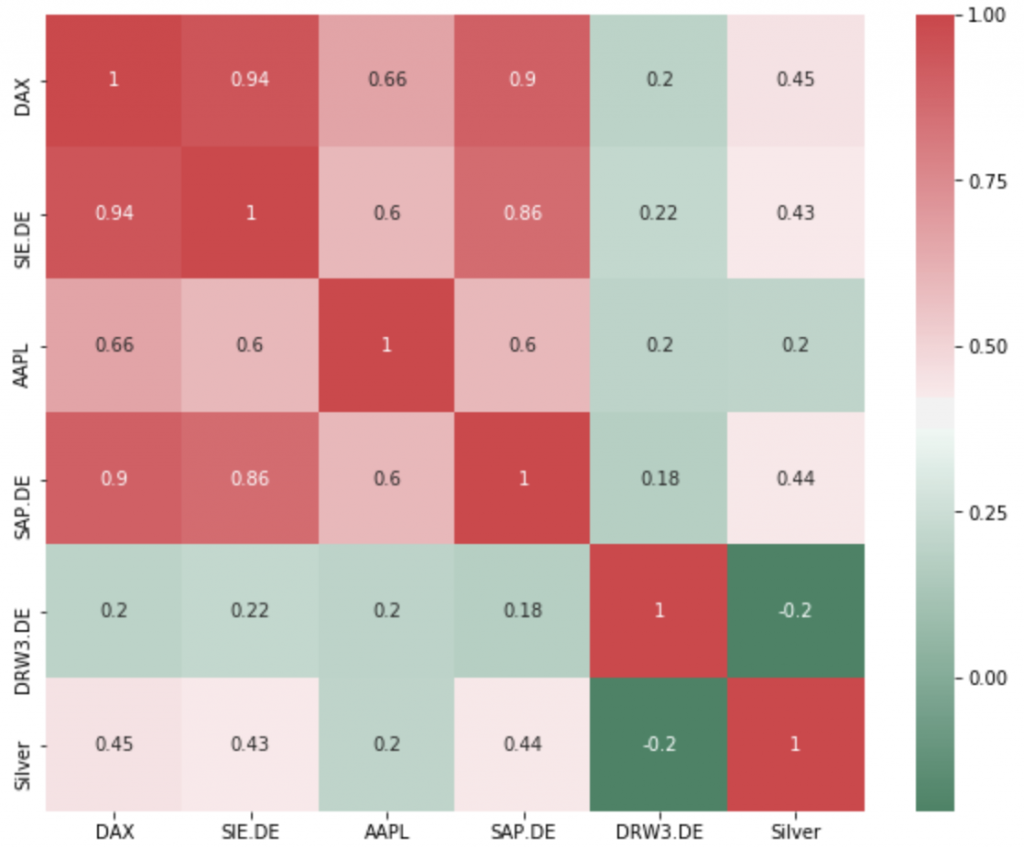
  • What are other good performing assets with low correlation (see my correlation articles) that suit my portfolio?

And if you’re curious about the dark green star in the upper right corner check out the code, build the chart and hover.

Example

See the interactive example here.

Source

https://github.com/ds4pi/performance-chart

Correlation in Python

How to create a correlation heatmap in python
and some specialities for mutual funds data

After introducing the correlation matrix and heatmap in R I’ll show you here how to perform this task in python. See for yourself which code suits you better.

For the correlation in python I programmed the following three notebooks. The differences lie mainly in the data supply.

  1. correlation-in-python.ipynb: The basic python notebook that uses the same input data as the corresponding R example.
  2. correlation-ip-yfin.ipynb: The correlation in python that uses the yfinance API as data source.
  3. correlation-ip-fonds.ipynb The correlation in python example that uses data from ARIVA and adds some mutual funds.

Let’s start with the first notebook for the direct comparison to the correlation-in-R: The data is read from CSV files containing the columns ‘Date’ and ‘Close’. To have comparable data (i.e. every data set contains the same date-values) I merged the input files into the merged_quotes pandas dataframe. To keep the R code clean I manually merged the files there. But with pandas this can be done on the fly:

merged_quotes = pd.merge(merged_quotes, quotes, on='Date')

If you want to check your merged data afterwards you should use the parameter ‘suffixes’ on the merge. Otherwise the columns will be named ‘Close_x, Close_y, Close_x, Close_y, …’. For the same reason I renamed the columns afterwards.

For the correlation matrix we need the percent changes from one day to the next. In the R-code this was “manually” done by the function getPVector (get performance vector). My Python code does this by applying pct_changes() to the complete dataframe (except for the column ‘date’, which was formerly dropped of course).

corr() calculates the correlation matrix on the percent changes. 

For the visualisation I used the easy to handle seaborn heatmap with a colour palette range from green to red. The parameter annot=True prints the correlation values in each square. If you prefer colours from blue to red you can simply replace the cmap by the value ‘coolwarm’.

Seaborn Correlation Heatmap
Seaborn correlation heatmap

The second code ‘correlation-ip-yfin’ loads the data from yahoo finance with the help of the yfinance api as described in my first post. Because it was so easy loading some more sets I made the entries list rather long. The fact that you only find a few really low correlations when using a 3-months-history is very interesting. And if you’re only looking at the correlation, the only suitable addition for any stock portfolio seems to be Drägerwerk, not only since the beginning of the corona crisis. But don’t forget to consider the performance.

The third notebook ‘correlation-ip-fonds.ipynb’ loads mutual funds and ETF data from previously downloaded files from ARIVA.DE. To retrieve the data remove the *.csv-files from the data-funds directory and execute the scripts there:

  • getQuotes.sh to download the data as [wkn]_historic.csv. You can use min_date and max_date to retrieve a certain period of data (e.g. getQuotes.sh 19.09.2019 03.04.2020)
  • revertFiles.sh to convert the data in usable format (date and close, order: from old to new)

This code has one special feature: after the first runs I realised that the ÖKOWORLD funds had a surprisingly low correlation. A closer look revealed that they apparently report their values one day later. So the data from these funds must be shifted by one day.

The funds are surprisingly high correlated. Even the MSCI World, the Emerging Markets and the Scandinavian funds. If you happen to find high-performance funds with lower correlations or an API for easier funds-data-download, please let me know.

Source

https://github.com/ds4pi/correlation-in-python

Correlation in R

Pick your stocks by Correlation –
Develop and visualise your portfolios’ correlation matrix in R

Modern portfolio theory has proven the fact that adding stocks with different price movements reduces your portfolios’ overall risk when other factors stay constant (i.e. performance). Stocks that react differently to external influences (e.g. oil price shocks or FED interest rate decisions) are less correlated with each other.

This correlation can be measured with statistical methods. The basic measurement for the joint variability of two variables is the covariance. The standardized measurement is the Pearson correlation coefficient that ranges from -1 to +1. A coefficient of +1 means perfect synchronical movement of both variables in the same direction, while -1 indicates perfect sync in different directions. A coefficient value of 0 states no relationship at all between the movements of both variables.

When looking for uncorrelated stocks as an addition to our existing portfolio we are therefore looking for stocks with small absolute values of their correlation coefficient with any other position in our portfolio. The instrument of choice is the correlation matrix and the visualisation is the correlation matrix’ heatmap.

Both are not hard to implement with some lines of R code.

First we download the historical data for the different stocks as described in the yfinance article and save it in the data directory. The historical data need some steps of preparation:

  • align the entries so that we have the same days for all stocks
  • remove everything but the close values from the files

Additionally the quotes must be sorted from old to new values (what is given if you download them by yfinance).

For this example I added historical data from silver (ticker symbol SI=F) to show an example of commodity correlation to stocks. Other values you’ll find in the data subdirectory are from common stocks like SAP, Apple and Drägerwerk. (If you find an API to reliably download mutual funds data please let me know).

The code starts by loading the corrplot package for plotting the correlation heatmap. Next is the function getPVector that returns a vector of performance values.

To have comparable values for the stocks we can’t take the raw quotes. But with the daily returns (daily performances) we have comparable movement variables regardless if we consider stocks, indices, funds or commodities. The daily performance is calculated by

\[p_{t}=\left(\frac{quote_{t}}{quote_{t-1}}-1\right)\times100\textrm{  [Performance in %]}\]

which equals

\[p_{t}=\frac{quote_{t}-quote_{t-1}}{quote_{t-1}}\times100\]

That’s what is implemented in getPVector.

Next there is the function to read the stock quotes (importPVector) and return the performance vectors which is then done by the lines starting with

dax <- importPVector("DAX.csv")

After importing we combine the vectors to the matrix ‘mat’ and as result retrieve the correlation matrix by using cor(). For better readability this matrix is rounded to two digits. And looks like this:

correlation matrix
Correlation matrix

The last two code lines build the correlation matrix’ heatmap.

correlation heatmap from corrplot
Correlation heatmap from corrplot in R

What do we do with these results?

  • The large red circles next to the diagonal identify our portfolios’ cluster risks. We can then think about repositioning in favour for less red circles (i.e. sell combined risks and rebuy positions with less correlations).
  • Next we see the fantastic low correlation with the small cap DRW (Drägerwerk) and DAX. The overall correlation with this stock and the other values is even better than the correlation with silver and the other values.
  • Check for suitable additions: you can now add and check buying candidates (and if you own large DAX-Index positions it will be clear not to add other large DAX stock positions like Siemens).
  • Try to download your ETF or mutual funds’ close values and check single stocks as candidates for correlation. Also check other funds as possible additions for correlation with your existing portfolio.
  • Check commodities (gold, silver, oil, …) as add-ons for your portfolio.
  • Find a way to reflect the combined position sizes in den heatmap fields (i.e. large circles for large positions, small circles for small positions). Then think about your large red circles in order to reposition your assets.
  • But if you find additions with minimum correlation to your existing portfolio positions don’t forget to think about the performance chances of that candidates!

Source

https://github.com/ds4pi/correlation-in-r

Links

Modern Portfolio Theory – systematic and specific risk
Pearson correlation coefficient
https://github.com/taiyun/corrplot
https://cran.r-project.org/web/packages/corrplot/

yfinance – Yahoo!finance Stock Data API

Get historical market data by API from Yahoo!finance for German and American stocks

Manually retrieving historical stock market data can be quite annoying if you need more than a dozen values or if you need to update them regularly.

The task would look like this:

Pretty easy if you need data for one stock. Not so easy if you want to download 30 DAX values or 60 MDAX values. Impossible if you want the S&P 500.

Retrieving stock data from an API offers great advantages compared to a csv download:

  • avoid manual tasks
  • repeatable script
  • get many time series fully automated

So let‘s create a script to automatically download stock quote time series for DAX and MDAX values.

This is where Yahoo!finance comes into play.

There is a pretty easy way to use the API for the Yahoo!finance data called yfinance: this API is created by Ran Aroussi and available from PyPI: https://pypi.org/project/yfinance/

After installing yfinance using pip we simply need the following lines to retrieve historical data for a given stock:

import yfinance as yf
symbol = 'aapl'
ticks = yf.Ticker(symbol)
h = ticks.history(period='10y')

We might only need the close values so our code would look like this:

history = h['Close']

If you need a CSV file for later use you can create it by the following lines:

path='out/'
history.to_csv(path+symbol+'.csv', sep=';', header=True)

The only problem for German stocks is:

Where do we find the symbols we use to retrieve the data?

If you don‘t know the symbols, www.dax-indices.com will help you:

Here we find the details and data for the DAX. Go there, find the link ‚Daten‘ and from the list ‚Zusammensetzung und Indikatoren‘ download the DAX file. In this Excel-sheet find the column ‚Trading Symbol‘, copy the 30 Values for the DAX Performance Index into an editor, append each symbol with .DE and save this list to a separate file.

To retrieve the values for other indices simply change the isin parameter in the url:

The S&P500 list can be found at datahub.io: https://datahub.io/core/s-and-p-500-companies#resource-constituents

If you need ticker symbols for individual other companies simply try to enter the name at https://finance.yahoo.com/ and find the symbol there.

The corresponding code for this example in my repository reads the DAX index list, retrieves 1 year of historical stock market data for each entry and saves the values to csv-files named after the ticker symbols.

Source

https://github.com/ds4pi/massdownload-yfinance